
Type Here
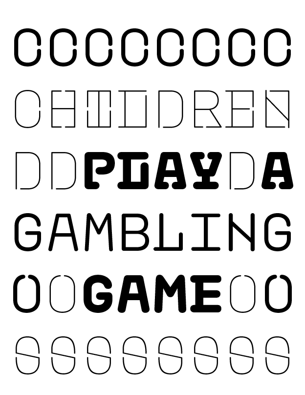
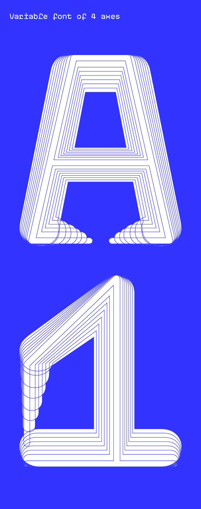
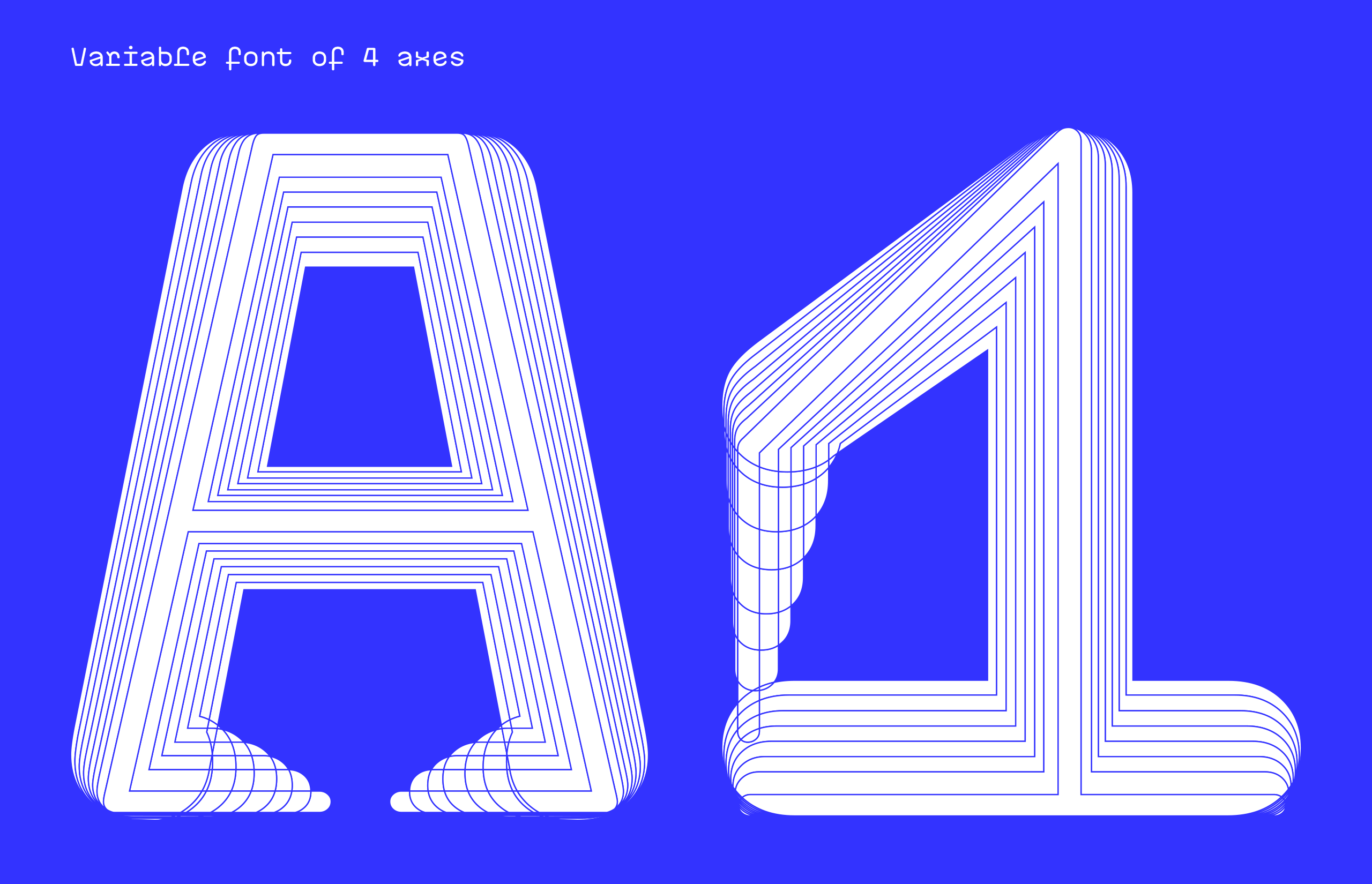
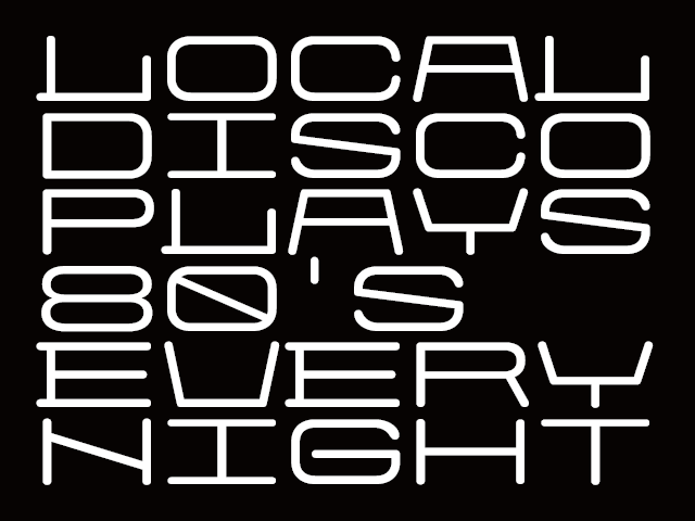
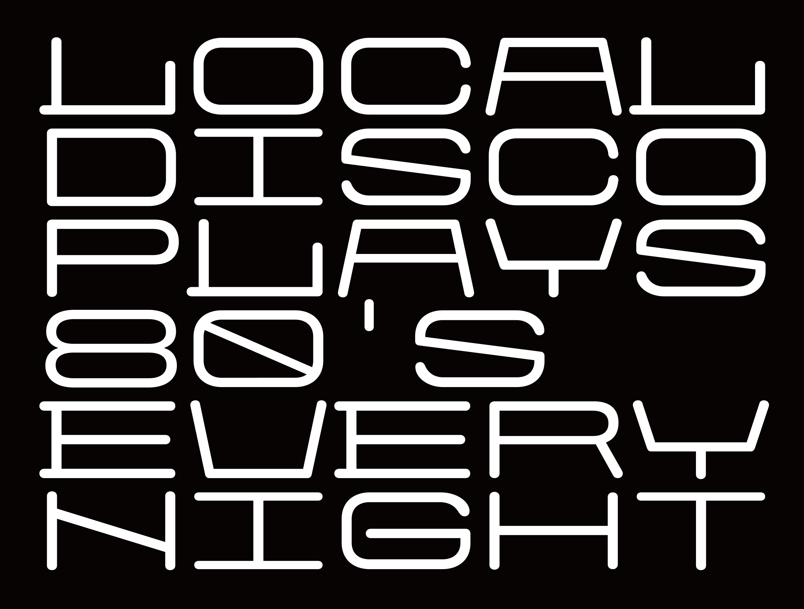
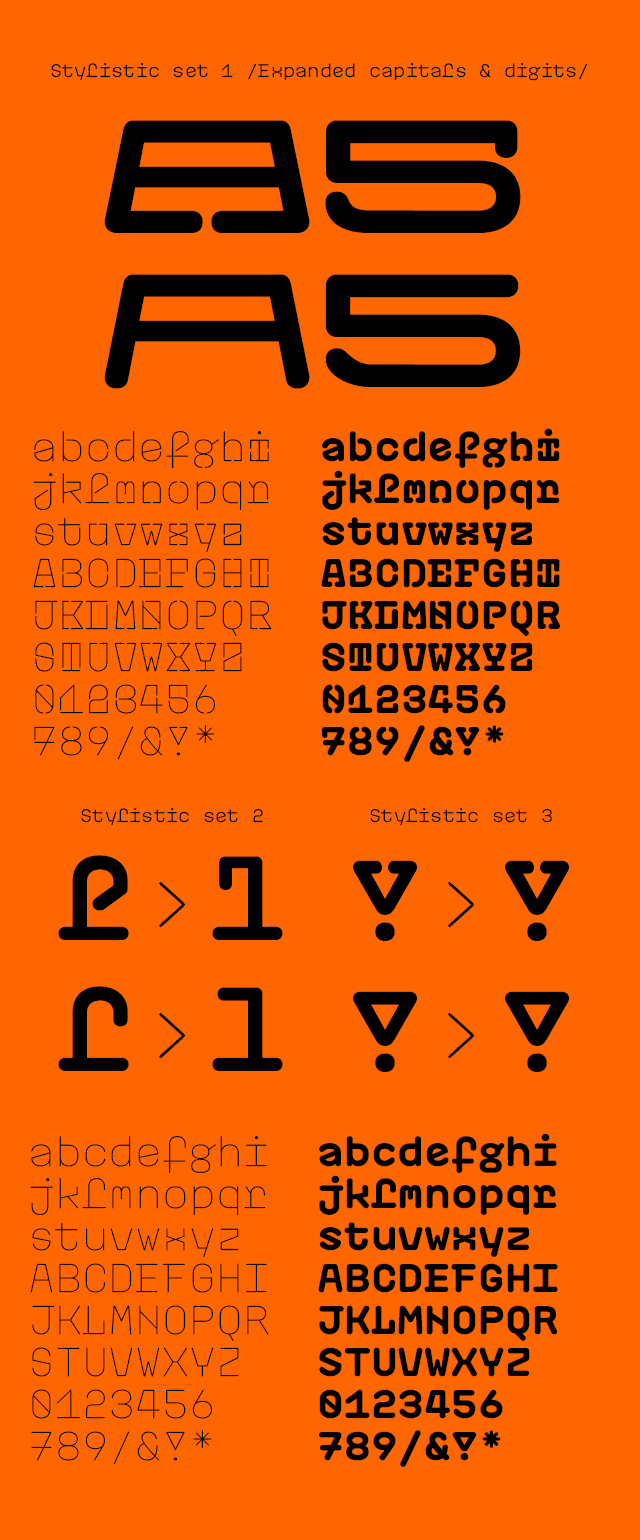
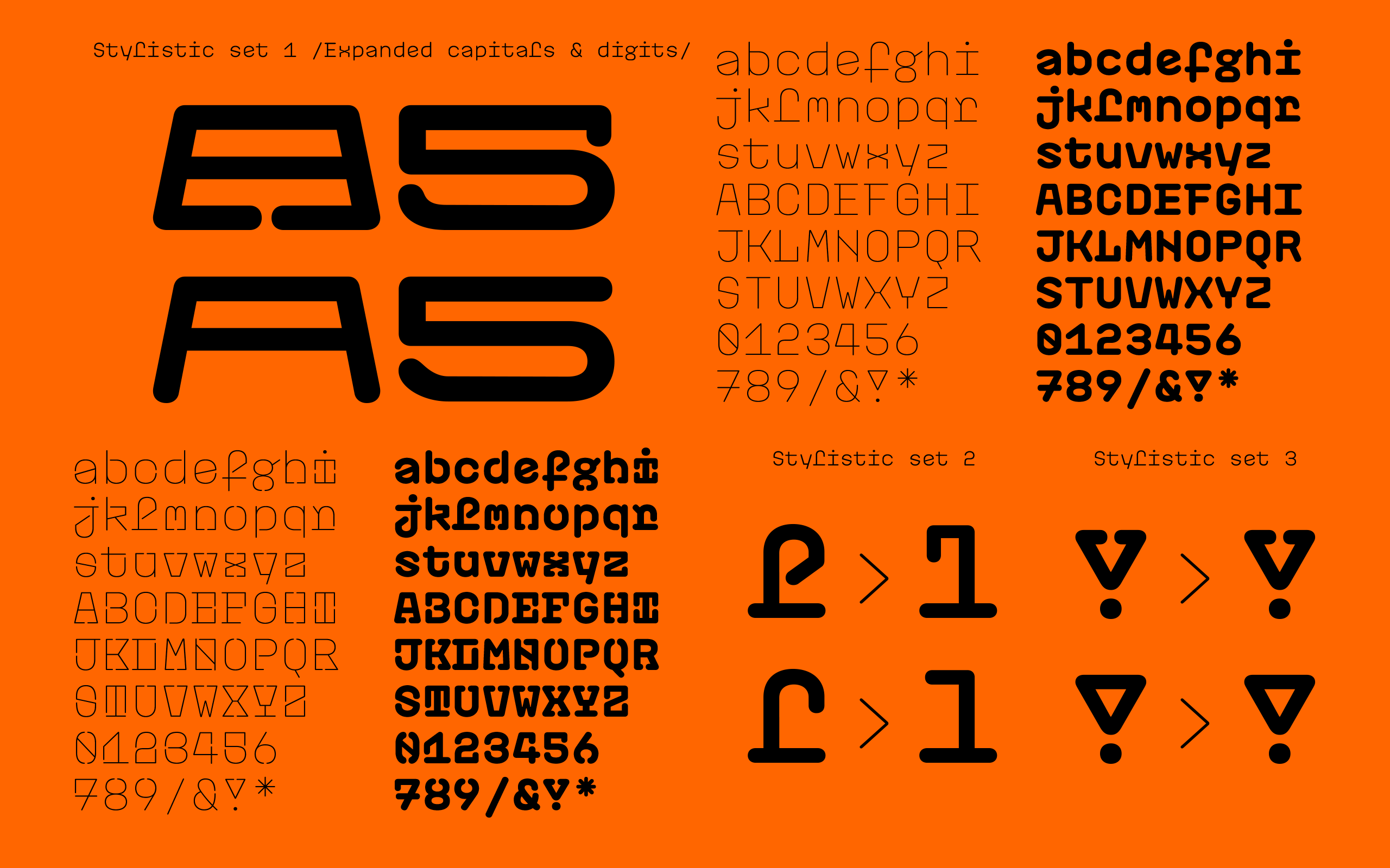
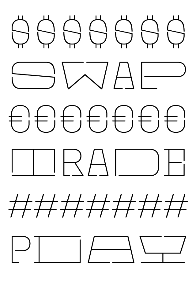
Plastic is a monospace variable font based on four master styles: Chain Black, Chain Thin, Simple Black and Simple Thin. The design of the “Chain” styles enables 3D printing as the individual characters can be easily connected through a special character gaps made of serifs at the end of strokes or by splitting up the round shapes e.g. “o” and “g”. On the other hand, the “Simple” styles have no such feature and they are better suited for longer texts and small text sizes. The variable format enables interpolation between four extremes on two axes: stroke weight and length of serifs. Plastic is a font with an array of styles and combinations that allows the user to freely select the weight and length of serifs according to individual needs.
Chain Black
Chain Bold
Chain Medium
Chain Regular
Chain Light
Chain Thin
Simple Black
Simple Bold
Simple Medium
Simple Regular
Simple Light
Simple Thin
The concept of the font is based on the “Cečka fever”, a phenomenon of collecting C-shaped plastic hooks in the communist Czechoslovakia. Originally manufactured to be hanged as decorative chains in windows and doors (as they can be linked up in chains), the C’s spontaneously became a popular toy among the kids growing up in the 1980’s. Another letters and geometric shapes were added later. The kids used to collect the C’s and create colorful bracelets and necklaces. They have even traded them, meaning that each shape, colour and material had a different value. They even “paid” with them for comic books or other valuables. The C’s became an unofficial currency for kids. They caused a national collecting craze. It became impossible to buy them in the shops so the parents had to “use their connections” to get them. If you had no C’s, you were not cool.

CZS

012 One
for three
333333
456
chewing
gums
789!!!
www.ivanapaleckova.com
www.jitkajaneckova.com
